Covid destroyed my plans to fly my first two soaring contests in 2020 – the 20m-2-Seater-Nationals in Montague, CA as well as the Region 9 Sports Class Contest in Nephi, UT. Both of these contests were postponed to 2021.
But there was one day in 2020 when I did fly in a friendly race: a bunch of pilots including myself made their way to Nephi for a practice week in preparation for next year’s contests. And on July 1 the organizers declared a contest task fit for the 18 meter class. It was the only day of the year where I flew exactly the same task as several other pilots. One day isn’t much to go by, but I wouldn’t be me if I skipped the opportunity to analyze the results. Especially since one of the pilots was John Seaborn, a multiple National Champion, and a fellow Boulder pilot. Don’t pass up an opportunity to learn!
The Task
The task was a Turn Area Task (TAT, aka AAT) with three assigned turn areas:
-
- Start: 04 SE Start – radius 5 miles
- TP1: 66 Nine Mile Ranch – radius 20 miles
- TP2: 81 Table Mountain – radius 20 miles
- TP3: 15 Browns Peak – radius 5 miles
- Finish: 05 Finish (i.e. Nephi Airport) – radius 2 miles
Task Distance: from 275.2 miles minimum to 447 miles maximum (364.4 miles from the center of each turn area to the next)
Minimum Task Time: 3 hours (this seemed extremely short to me based on the task distance, so I basically decided to ignore it and just fly around the task as fast as possible). There was no declared maximum start altitude.
The Pilots
There were 18 pilots flying from Nephi that day. However, flying the task was entirely voluntary and I don’t know how many attempted it.
At least six pilots uploaded flight tracks to OLC that show valid task declarations for this particular task in their flight recorders. Five of them finished the task. I based my analysis on the five finishers because these flights are most directly comparable.
- Pilot A, Hph 304 SJ 18 meter. Current Pilot Ranking: 91. Holds FAI 1000km Diploma. Several top 5 finishes at Sports Class contests
- Pilot B, LS3a 15 meter. No information found on the SSA website.
- Pilot C, Ventus 2cxa FES 18 meter. Current Pilot Ranking: 73. Participated at several Regional Contests.
- Pilot D, JS3 18 meter. Current Pilot Ranking: 100. Multiple National Champion. World Championship Contender.
- Pilot E, Ventus 2cxT 18 meter. No Pilot Ranking.
I am pilot E. 😉
Overall Results
I have attempted to score the flight according to SSA Sports Class rules and applied handicaps for the gliders (because one of them was an older 15m ship that clearly was not competitive with the 18 m gliders of the other 4 contenders.

These were the results (provided that I did the scoring correctly which is, frankly, insanely complicated):
- 1st Place: Pilot D. 1000 points (blue trace)
- 2nd Place: Pilot E. 823 points (purple trace)
- 3rd Place: Pilot A. 804 points (red trace)
- 4th Place: Pilot C. 783 points (green trace)
- 5th Place: Pilot B. 614 points (yellow trace)
The following table shows the raw speeds (before applying the handicap) and is easier to understand:
| A | B | C | D | E | |
| Avg. Speed (kts) | 69.2 | 50.6 | 67.3 | 86.0 | 70.8 |
Not surprisingly, Pilot D – the multiple National Champion, let’s correctly identify him as John Seaborn :-), posted the fastest speed, and won by a wide margin.
Pilots A, C, and E were fairly close together (separated by 3.5 kts or 40 points), but far behind John. I was quite pleasantly surprised to find that I came in 2nd place, even though my performance was vastly inferior to John’s.
Pilot B was considerably behind everyone else. However, his raw speed is not comparable because he flew an inferior glider (the 15m LS3a).
Analysis
Just looking at raw speeds and point totals doesn’t really teach me anything except that I can’t compete with John Seaborn. But that I already knew.
So let’s dig a layer deeper and look at some key stats to see some of the differences, in order to understand why John was able to score so much better than anyone else.
(1) Cruise Speeds
Given that John’s average speed of 86 kts was more than 15 kts faster than that of any other pilot it would seem likely that he flew much faster between thermals.
And in fact, John did indeed fly much faster than anyone else:
| A | B | C | D (John) | E (myself) | |
| Avg IAS during cruise flight | 78 | 66 | 84 | 92 | 76 |
John’s average indicated air speed in cruise flight was 92 kts, 16 kts faster than mine.
John was also 15.2 kts faster overall on average so at first glance it would be tempting to attribute John’s superior overall performance primarily to his higher cruising speed.
But beware! This line of thinking would be a big mistake!
Let’s figure out how my overall average speed would have been affected if I had matched John’s speed and flown 16 kts faster during my cruise segments. Had I flown at 92 knots instead of 76 knots, my sink rate would have been about 110 fpm greater than it actually was. (Based on the wing loading of my Ventus 2xcT with partial water ballast my sink rate at 76 kts IAS was about 180 fpm; at 92 kts IAS (John’s cruise speed) it would have been ~290 fpm).
While flying faster would have meant that my cruise time would have shrunk by 17.4% from 196 minutes to 162 minutes (i.e, by 34 minutes), I would have lost an additional 11,700 feet of altitude (162 min x 290 fpm – 196 min x 180 fpm). At my average climb rate of 4.2 kts (~420 fpm), it would have taken me 28 minutes to regain that altitude.
This means, my overall flight duration would have improved only by about 6 minutes, not by 34 minutes! My average speed would have increased from 70.8 knots to 72.7 knots. A little faster, yes, but still nowhere near John’s performance. My point total would have increased from 823 to 845.
In other words, John’s higher average cruising speed explains about 1.9 kts of the 15.2 kts speed difference between his flight and mine. That is 12.5% of the total performance difference.
BTW – this improvement assumes that I would have been able to maintain the same 4.2 kt climb average and not been tempted (or forced) to take weaker climbs as a result of losing altitude faster.
Let’s also calculate what would have happened had I flown just 5 kts faster: 81 kts instead of 76 kts IAS. My cruise flight duration would have been 186 minutes (10 minutes shorter) but my sink rate would have been approx. 25 fpm worse (based on my glider’s speed polar at my actual wing loading). In this case I would have lost an additional 2,850 ft over the course of the flight (196×180-186×205=2850), which would have taken me close to 7 minutes to regain while circling (2850/420=6.8). I.e., I would have saved a little over 3 minutes in total.
So, could or should I have flown faster. Yes. Would it have had a big impact? Probably not. Would it have made me as fast as John? Most definitely not!
The reality is that modest variations in average cruise speed by 5%, 10% or even 15% have only a fairly minor impact on the overall average performance because they are largely offset by the glider’s varying sink rates at different air speeds. McCready’s speed to fly theory is of course accurate but its importance tends to be overrated. Especially because there is also a strategic price to pay for faster cruise speeds: because the glider sinks faster to the ground the pilot has fewer options to select suitable thermals. This means that the faster flying pilot may find high average climb rates more difficult to attain. He or she also faces a higher land-out risk.
So, if John’s higher cruise speed wasn’t the main reason for his superior performance (it wasn’t), then what was? Let’s look at other potential reasons below.
(2) Flight Duration
| A | B | C | D (John) | E (myself) | |
| Distance (miles) | 291.9 | 285.7 | 326.4 | 297.1 | 313.2 |
| Duration | 3:39:57 | 4:54:01 | 4:12:42 | 2:58:50 | 3:50:36 |
In a Turn Area Task with a minimum task time, flight duration is a relevant factor. The minimum task duration was 3 hours, and John optimized his time quite well – although he would have scored even higher had he flown the full 3 hours and not finished 1 minute and 10 seconds too early. In fact, had he flown exactly three hours his average speed would have been 86.6 kts instead of 86.0 kts (assuming that he had enough altitude to extend his flight just a little at the last turn point – as in fact, he did). 0.6 kts may not sound much but it could make a crucial difference if the results are very close. (Per my calculations, the point difference between John and the other pilots would have been 6 points greater had he finished at an average speed of 86.6 kts instead of 86.0 kts).
Coming in “right on time” (or slightly above) is usually an advantage because the start altitude is considerably higher than the finish altitude and a pilot who flies just the minimum time (and no longer) is best able to convert that altitude difference into a higher average speed.
How big is this effect on a 3 hour task? Not insignificant. Math guru John Cochrane has done the work and given us some formulas to estimate the effect. On a three hour task in western conditions, the cost tends to be about 0.5 score points per minute of overtime. I.e. my 50 minutes of overtime might have cost me about 25 points. I.e., instead of being 177 points behind John, I might have only been 152 points behind, had I been able to finish the task in 3 hours instead of taking 3 hours and 50 minutes.
In other words: my 50 minutes of overtime explains about 14% of the overall performance difference between myself and John.
(2) Circling Percentage
| A | B | C | D (John) | E (myself) | |
| Circling %age | 23% | 30% | 23% | 20% | 15% |
A popular metric to compare flights of different gliders is to look at the amount of time pilots spend circling versus cruising. Since you’re not moving forward while you go around in circles, a high circling percentage tends to be a disadvantage.
John’s circling percentage was indeed quite low: 20%. However, it was not the lowest. In fact, I spent even less relative time circling than John did: only 15%!
But did this lower circling percentage give me a demonstrable advantage? Unfortunately that is impossible to say! The problem with the metric “circling percentage” is that it is a complex data point – a composite of several factors that include not only route selection (e.g. flying through lift vs sink), but also flying speed (if you fly slower your sink rate is lower, i.e., you arrive at the next thermal higher, and you need to circle less.)
Because of its composite nature it is impossible to say that the pilot with the lower circling percentage necessarily gains an overall advantage.
(3) Effective Glide Ratio
Highly related to the circling percentage is the effective glide ratio achieved in cruising flight. This is in part a measure of how effectively a pilot is able to follow energy lines, but, just like the circling percentage, it is also a composite metric driven in part by the inter-thermal cruise speed.
The more effective one is at following energy lines, but also, the slower one flies, the less one needs to circle and the higher the effective glide ratio. And indeed, the results show a mirror image of the circling percentage:
| A | B | C | D (John) | E (myself) | |
| Glide Ratio | 73 | 40 | 66 | 79 | 93 |
My effective glide ratio of 93:1 was better than anyone else’s. John’s 79:1 came second. However, just like the circling percentage, this metric ultimately doesn’t mean very much.
(Note: a reader might wonder how it is possible to achieve such high effective glide ratios with gliders that have a “best” glide ratio of around 50:1 when flown at best L/D speed (i.e. much slower than we were flying). The answer, of course, has to do with the pilot’s ability to follow energy lines – areas where the air is on average rising instead of sinking or just standing still. More about that right below.)
(4) Following Energy Lines
The circling percentage and the effective glide ratio might be taken to mean that I did better than anyone else in terms of following the best energy lines. However, as I mentioned, both metrics combine the effects of following energy lines and the actual inter-thermal cruise speed.
A much purer measure for the ability to follow energy lines is the netto value during the straight flight segments. Netto measures the actual vertical movement of the air that the glider flies through and is not impacted by the glider’s sink rate. Hence, it just measures the effectiveness of the choice of route and is thus a much better metric to use.
| A | B | C | D (John) | E (myself) | |
| Netto in straight flight (kts) | 1.8 | 0.5 | 1.6 | 2.1 | 1.6 |
This table shows that it was John who did the best job with respect to following energy lines. During all of John’s straight flying segments the air rose at an average rate of 2.1 kts. On this measure Pilot A ranked second with an average netto value of 1.8. Pilots C and E (myself) were tied in third place with a netto value of 1.6 kts.
How much difference did this make? John spent 2 hours and 22 minutes in straight flight. During that time the airmass he flew through went up by an average value of 2.1 kts, approx. 210 fpm. That is 50 fpm more than during my flight where it went up on average by 160 fpm. Over John’s entire task this difference amounts to 7,100 feet (50 fpm x 142 minutes). At my average climb rate of 4.2 kts (~420 fpm) – see below – I needed 17 minutes to climb 7,100 feet. On a 3 hour task, 17 minutes equals 9.4% (17/180). And 9.4% is the difference between John’s winning speed of 86 kts and a speed of 78 kts.
In other words, John’s superior performance with respect to following energy lines explains 8 kts (more than 50%) of the 15.2 kts speed difference between our two flights. It is thus the single most significant factor of John’s overall superior performance!
Since this is such a hugely important factor I also tried to understand specifically what John did better in terms of following energy lines. This is very difficult to glean from the data alone but I was able to combine evidence from the flight trace and an analysis of my inflight video recording. Let’s take a closer look.
The following graph overlays the flight traces of John and I. John’s trace is shown in red and my trace is shown in blue.

The graph above indicates where John and I made different route choices, especially with respect to approaching the first turn area (top right) and the second turn area (bottom left). But it tells us nothing as to which of the two traces followed better energy lines.
Fortunately, SeeYou (the flight analysis software from Naviter) allows us to display the traces based on their netto values as well. This is shown in the graph below.

You have to be careful to remember which trace belongs to which pilot. That’s why I included the graph earlier that clearly shows which of the two traces belongs to John and which one belongs to myself.
At first glance there doesn’t appear to be too much difference. But if we take a closer look at the approaches to TP1 and TP2, we can see some subtle differences in the color gradient.
Let’s look at the approach to TP1 first:
The differences are subtle but it you look carefully, you can see that my trace (the one further north) towards and away from TP 1 contains somewhat more blue segments than John’s (the one further south).
(Note: you can also see that I wasted quite a bit of time after turning TP1 trying to climb. I was uncomfortable with my altitude and made a number of unsuccessful exploratory turns. This was another contributing factor to my overall performance; it is discussed below under point (5) Climbing).
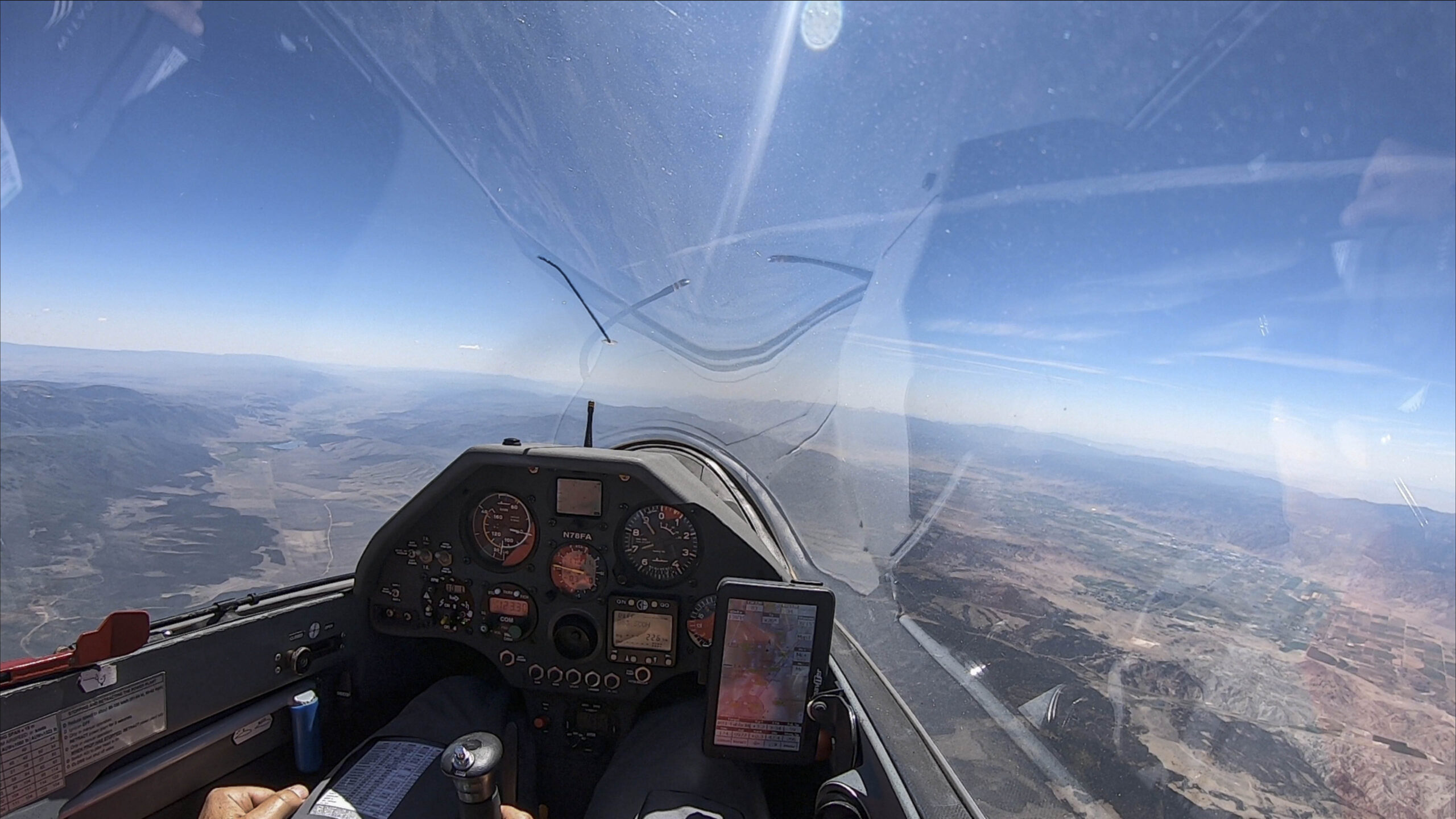
One might wonder: why did I fly such a northerly line to TP1, just barely nicking it and then heading back west? The answer is in the following image, taken a few minutes before I turned right to nick the the turn area:
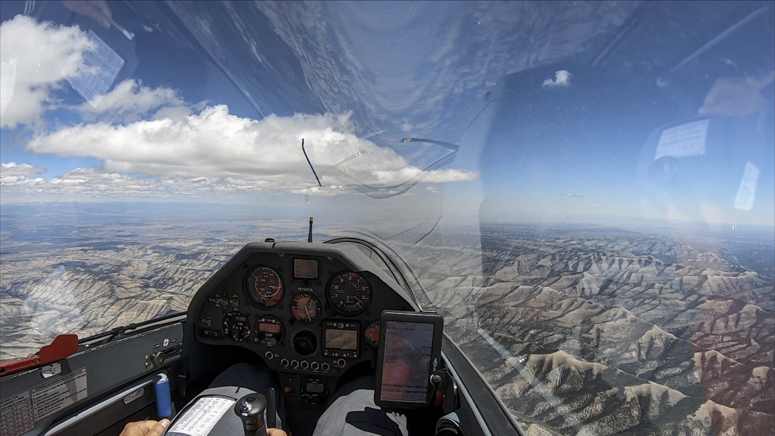
To get to TP1 I followed a cloud street to the northeast, which ran past the turn area to its north. The turn area itself was in the blue to the right in the picture above.
Why did John decide not to follow the same line? I don’t know for sure but I can speculate. Let’s come back to this below after discussing TP2.
Here’s our different approaches to TP2. Let’s look at the graph:
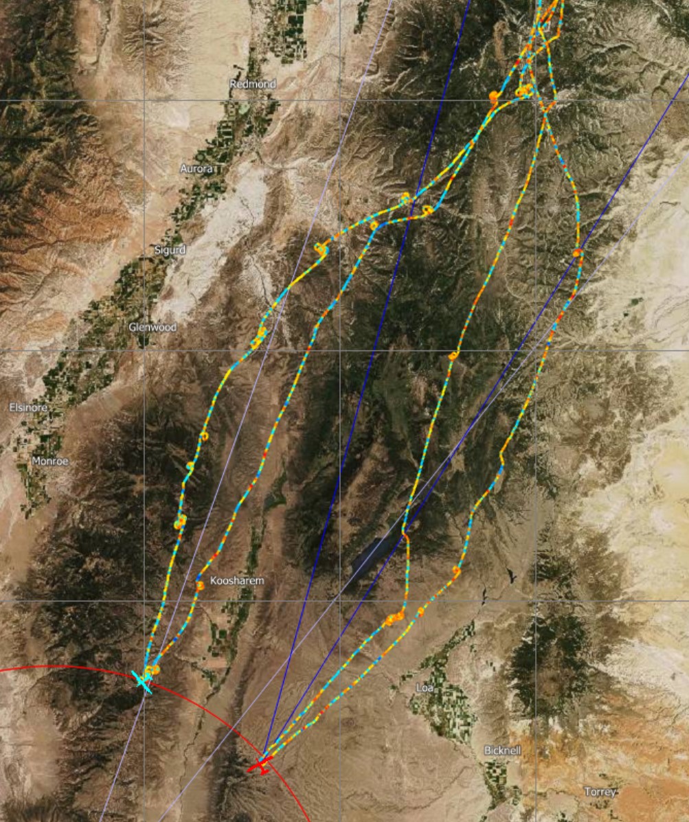
John’s trace is the one further east (right), and mine is the one further west (left). Once again you can see that there seems to be a bit more blue in my trace than in John’s trace.
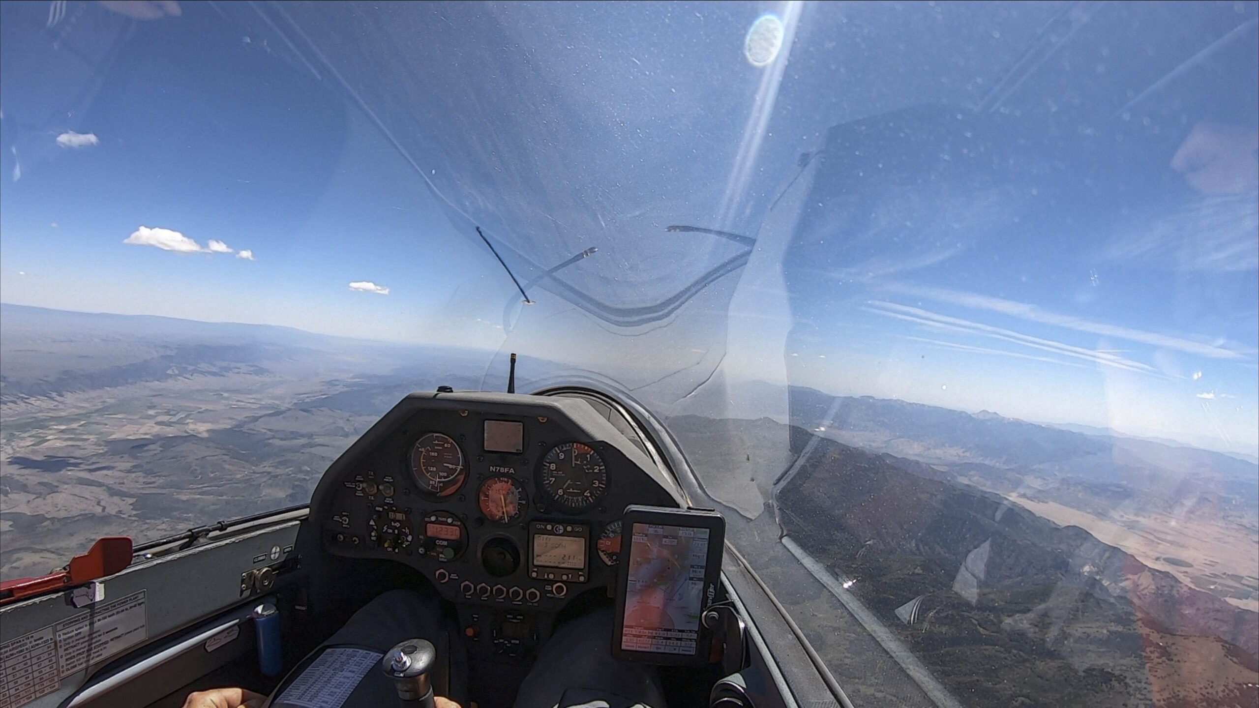
Why did John take the easterly route while I took a more westerly line? Here’s what the sky ahead looked like as I was heading towards TP2:
In the picture above I am about 25 miles north of TP2. I dare say there wasn’t much to go by to determine what route to take. The sky was entirely blue. I simply stayed above the high ground of the Wasatch Plateau and took pretty much every lift I could find to stay high.
As you can see from the trace, John flew a more easterly line. Did he know something that I didn’t?
Here is the answer: John had started the task much later than I did and came to the same area about 20 minutes after I did. Here is what the sky looked like by the time John was still about 25 miles further north:
A nice line of clouds developed further east that had not existed earlier. John could see the clouds ahead and was able to follow them while I was already too close to the turn area by the time the clouds appeared.
This means that a key reason why John was able to find a better line to and from TP 2 was that he timed the start of his task better: while I made the rookie mistake of starting as soon as I was up and seeing a path to get to TP1, John decided to wait for the day to develop further. As it turned out, these 20 minutes played a big role!
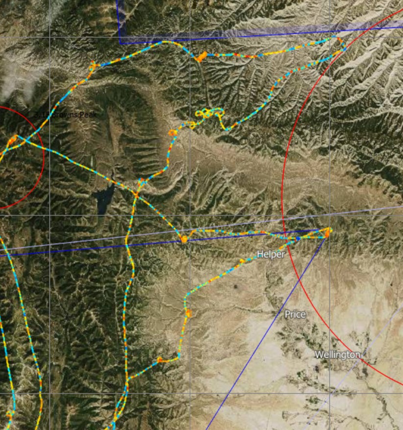
Let’s revisit the approach to TP1 as well: I believe, John’s later start also allowed him to fly a more direct route into the first turn area.
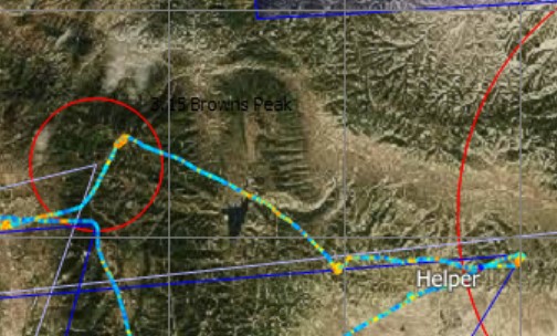
The above image shows John’s trace. Note the 90 degree kink in the line near Brown’s Peak on the left. This is just speculation but I think that John may have changed his course because he could see the first cloud appear in the turn area, which had been completely blue when I approached it earlier. You can see that John also didn’t just “nick” the turn area but continued into it for a few miles where he climbed in good lift. I have to believe that a cumulus had formed by the time he entered the turn area (almost one hour later in the day than I did). This would underscore the advantage one can gain by starting later and letting the day develop before going on task. (Obviously this makes only sense when the better part of the day is ahead and there is no risk of being unable to finish.)
Note that by flying a direct line to TP1, John was also able to reduce the total task distance and finish much closer to the minimum finishing time. Had he continued to the northern edge of the turn area (as I did), John would also have finished with overtime. I discussed the advantage of finishing on time in Section (2) above.
In summary I conclude that John’s decision to start the task later was a key factor helping him follow better energy lines, because he was able to follow cloud lines that had not existed earlier and thereby increase the ratio of flying in lift vs. in sink.
(5) Climbing
Pilots who are able to thermal better than their competitors can also gain a major advantage. And indeed, John’s average climb rate of 4.9 was clearly better than anyone else’s:
| A | B | C | D (John) | E (myself) | |
| Avg climb rate kts | 3.7 | 3.9 | 3.8 | 4.9 | 4.2 |
The delta between John’s climb rate and mine is 0.7 kts or 70 ft per minute, just over 1 ft per second. This may not sound like much but it adds up. John spent 36.6 minutes circling. In that time he gained about 2,500 ft more than I did (36.6×70=2562). Which means: I would have needed six minutes longer to achieve the same gain of height (2562/420=6.1). On a 3 hour task, six minutes are 3.3% or the difference between 86 kts (John’s winning speed) and 83.2 kts.
In other words, John’s superior climb performance explains 2.8 kts (almost 20%) of the 15.2 kts speed difference between our two flights.
Once again, I tried to dig a little deeper. Did John actually center the thermals better or did he just do a better job at thermal selection?
The data point to both being factors: John spent most of his circling time in 5, 6, and 7 kt thermals; whereas I spent most circling time in 4, 5, and 6 kt thermals. I also wasted about 10 minutes trying to climb in sinking air and lost a total of 1500 ft whereas John wasted only 5 minutes this way and only lost 200 feet.
I lost this wasted time in two places: (1) when I got lower than I liked coming out of TP1 with still some blue sky to cross ahead, and (2) when I tried to stay high prior to TP 2 with only blue sky ahead. (A later start may have helped reduce some of the wasted time because clearly marked thermals ahead would have given me more confidence and lessened the impetus to try every lift that I encountered in the blue.)
This difference of 1300 feet extra wasted explains approx. another 10% (or 1.5 kts) of the delta between John’s performance and mine. The additional 5 minutes wasted account for another 3% (or 0.4 knots).
| A | B | C | D (John) | E (myself) | |
| # of Thermals | 21 | 37 | 18 | 14 | 19 |
| Avg Glide Distance (miles) | 15.3 | 8.5 | 20.1 | 23 | 18 |
| Avg Altitude Gain per Thermal (ft) | 914 | 948 | 1270 | 1291 | 766 |
John also took only 14 thermals with an average altitude gain of 1300 feet per thermal and flew on average 23 miles between thermals whereas I took 19 thermals with an average altitude gain of less than 800 feet per thermal and only flew 18 miles between thermals. This is illustrative of my overly conservative flying style. (Another indicator is that my thermal entry altitude was consistently about 1000 feet higher than John’s.)
The number of thermals chosen and the average altitude gained per thermal do not impact the overall performance “per se”. But they are an important reason as to why my average climb rate was lower than John’s: each time you stop to thermal you have to first center the thermal before you can get the most out of it. John did this 14 times and I did it 19 times. It goes to reason that centering more thermals made my climbs less efficient and is a significant contributor to John’s superior climb rate.
(6) Other Potential Factors
(a) Speed Variations in Cruise Flight
One might think that pilots could gain a significant advantage by really slowing down in rising air and speeding up in sinking air. However, the following chart shows that none of the five pilots varied the speed significantly from their average cruise speeds while flying through rising and sinking air. The data are in kts IAS relative to the average IAS flown by each pilot.
| A | B | C | D (John) | E (myself) | |
| Slow down in rising air (relative to avg) | -4 | -5 | -6 | -5 | -4 |
| Speed up in sinking air (relative to avg) | 2 | 1 | 2 | 2 | 2 |
I was especially surprised to see that none of the pilots sped up much while flying through sink.
I think the problem is that varying the cruise speed between lift and sink works great in theory but is very difficult to do in practice. If you find yourself in sink and speed up, chances are that you fly too fast through the next patch of rising air. Conversely, if you’re flying in lift and slow down, it’s quite possible that the lift will have ended by the time your speed has come down and now you’re going too slow in sink. In the soaring literature this is often referred to as “chasing MC speed” and I am not the first one to observe that it doesn’t really work in real life. In addition to always lagging behind in your reaction it is also inefficient to constantly vary your speed by pushing and pulling. Obviously, it does make sense to vary your speed if you positively know what’s just ahead (e.g. if you’re closely following another glider and can observe it rising or falling). But in the absence of compelling clues it is often better to just maintain your speed during cruise.
(b) Tactical Turn Point Height
Turn Point 2 was located directly into a 13-16 kt headwind from SSW and provided an opportunity to gain an advantage by rounding the turn point low and then using the tailwind to gain altitude while moving on towards Turn Point 3.
| A | B | C | D (John) | E (myself) | |
| Altitude when rounding TP2 | 15,343 | 15,500 | 16,946 | 15,441 | 15,035 |
The table above shows relatively small altitude differences among the various pilots when rounding TP2 and suggests that none of the pilots gained a tactical advantage. Turn Points 1 and 3 offered much less opportunity to gain an advantage.
(c) Start Timing
John Seaborn was the only one of the five pilots who seemed to deliberately time the start based on improving soaring conditions. Everyone else started right after gaining sufficient altitude to get going.
| A | B | C | D (John) | E (myself) | |
| Start Time | 13:07 | 12:49 | 12:12 | 13:41 | 12:48 |
It is impossible to directly measure the impact of the different start times. However, as we have seen, waiting to start late was likely a key underlying contributor to John’s superior performance as it helped him follow appropriate energy lines and improve his climb performance.
(d) Start and Finish Altitude
Since this was just a practice task, there was not a declared maximum start altitude although I suspect John deliberately started lower for practice reasons. A higher start altitude would have provided an advantage.
| A | B | C | D (John) | E (myself) | |
| Start Altitude | 13265 | 15637 | 15148 | 12558 | 15458 |
| Finish Altitude | 9410 | 8081 | 7582 | 9221 | 9645 |
Minimum Finish Altitude was 7000 ft and most everyone returned significantly higher than that. I remember there being a lot of lift on the final leg and I flew close to Vne or the altitude and I still came in more than 2,500 ft too high. John was just a few miles behind me and flew through the same air, also finishing high.
By starting ~3000 ft higher than John and finishing ~500 ft higher I gained a net advantage of 2500 ft, which translates to a six minute time advantage in my favor (2500/420=5.9) and can alternatively also be expressed as a speed advantage of 2.8 kts in my favor.
Summary
George Moffat explained in his classic book “Winning II” (p. 42-50) that winning can be viewed as the result of not losing. He illustrates that the winner of any particular flight usually did several or many things (big and small) a little better than his or her competitors, and that the win can therefore be explained as a sum of all these things.
If I contrast John’s flight with mine, here is a summary of the things that John did better than I, and how much each factor contributed to the overall results:
-
- Following energy lines (measured by netto in cruise flight) … 8 kts
- John climbed better (measured by average climb rate) … 2.8 kts
- Time and altitude wasted in “trying out thermals” … 1.9 kts
- Finishing on time vs. finishing with 50 min overtime … 1.7 kts
- More optimal cruise speed … 1.9 kts
Total difference: 16.3 kts
As discussed I believe that John’s decision to delay the start of his task until 13:41 (53 minutes later than my start) contributed to his ability to follow better energy lines, finish closer to minimum time, reduce time wasted in exploring thermals in the blue, and possibly even achieve a higher average climb rate.
From the 16.3 kts we have to subtract factors where John put himself at a disadvantage:
-
- Net difference in start/finish altitude … 2.8 kts
- John finished 1 min 20 seconds under minimum time … 0.6 kts
In sum, the analysis explains 12.9 kts (16.3 – (2.8+0.6)) of the overall speed difference between our two flights while the actual speed difference was 15.2 kts. This leaves just 2.3 kts of speed differential unexplained.
I believe that some of the unexplained 2.3 kts may be attributable to John’s slightly superior glider (a new JS3 vs compared to my 17-year old Ventus 2cxT) and potential differences in wing loading (I flew with 2/3 water ballast; I don’t know John’s wing loading but it may have been higher than mine).
Key Lessons
(1) Focus Most on What Matters Most: Energy Lines and Climb Rates!
This deep-dive analysis of one single flight suggests that the following two factors have the biggest impact on overall performance:
-
- The ability to follow energy lines (as measured by “netto” in cruise flight)
- The ability to avoid weak climbs, minimize tries in sink, and achieve a high average climb rate (selecting the most appropriate start time can play a major contributing role)
These two things not only have the biggest impact, they are also skills that one must develop and hone over time. And they are relevant on every single flight.
Over the past two seasons I have significantly improved my ability to follow energy lines but I still have a ways to go as this one flight clearly shows. Starting a task later in the day can make energy lines more visible.
I have also been working on improving my climb rate in thermals and there are still some low hanging fruit such as thermaling slower and tighter. The data suggest that I also have an opportunity to become more selective: I should skip more of the weaker thermals and use more of the available altitude band. It is best to only take thermals that offer an average or better climb rate. And it is critical to minimize the time it takes to center them. That’s why it is generally better to take fewer thermals. In contests it is often best to take thermals marked by other gliders, precisely because others have already done the centering work for you (obviously assuming that they did it right.) I was actually encouraged to see that my avg climb rate was “only” 15% lower than John’s.
(2) Picking the “Right” Start Time
It seems that picking the right start time was a key underlying contributor that may have helped John achieve a superior performance – especially with respect to following energy lines and achieving a superior average climb performance.
(3) Other Tactical Improvement Opportunities
Compared to the overarching factors above, everything else is secondary (although, of course, it also adds up). Interestingly, most of the other contributing factors are more tactical in nature and can be more readily improved by an average pilot, including:
-
- Not leaving potential energy on the table by departing too low or finishing too high. The departure altitude is relatively straightforward as in contests it tends to be a given. The finish is trickier and my conservative approach means that I am likely to come in too high. I will need to practice more final glides to gain the confidence to finish close to the minimum finish altitude.
- Optimizing the finish time (avoid under time; minimize over time). I have been practicing a few TATs and they are more fun than I initially thought. On this particular flight I believe that a later start time might have helped me pick a shorter flight path and finish closer to minimum time.
- Flying closer to MC speed. The stats on this flight showed – once again – that I am among the more conservative XC pilots. There’s definitely some room for me to fly faster and take higher sporting risks. However, the rewards of flying faster are not huge and I will always have to balance this against the added land-out risk and the risk of having to take weak climbs that could destroy my overall result.
- Turning upwind turn points low and downwind turn points high. This did not play a big factor on this particular task, likely because TP2 (where it would have helped) was in the blue and I therefore tried to stay high. However, from my experience with Condor I know that this tactic can have a significant impact on the overall result.
- Speeding up in sink and slowing down in lift. This is great in theory but the data suggest that it may be impractical to do this efficiently in reality, especially with a ballasted high performance glider. Lift and sink tend to alternate so quickly that it is often impossible to vary the airspeed in a timely manner. There is nothing worse than pulling up in lift only to find oneself in sink again right when the glider has slowed down; or conversely, to push down in sink only to find oneself shooting through the next patch of lift at high speed.
(4) Don’t Look Too Much At Composite Metrics such as Glide Ratio and Circling Percentage
Composite metrics that I have liked to look at in the past such as circling percentage and effective glide ratio achieved, have more entertainment value than analytical value. You won’t win a race because you have achieved the lowest circling percentage or the highest effective glide ratio. You primarily win the race because you consistently flew through better air than your competitors (as measured by netto), and because you achieved a high average climb rate, especially by picking a limited number of good thermals and successfully avoiding weak climbs.
Enjoyed the comparative analysis. You did well! I expect a greater improvement from you next year.
Hi Joe, thanks, we’ll see 🙂 That’s the idea. Better performance based on improved understanding.
Great analysis, Clemens!
With respect to climbing efficiently I would always look for what I call “quality climb (metric)” and define by the product of averaged climbrate and altitude gained of any used thermal.
For example: gaining 5000 ft in a 10 knot thermal will really increase your average speed, 1000 ft in a 12 knotter not so much, you better continue your high speed cruise and not waste time to center those 12 knots.
Or: don’t milk that 400fpm from down low all the way up to cloud base (at 17’000) if there’s a decent chance – in your risk assessment – that you’ll find something stronger. Only climb high enough to get to the boomer…
I know – practice, practice….
Hi Wolf – I like that metric, makes great sense. Thanks for the tip!
Thanks for clear analysis!
Best greetings from Germany
Heiko Wassill 7P
Very interesting analysis !
Thanks for sharing.
I would maybe add another point to your analysis which is the deviation.
Seeyou does not show this data directly but you can easily compute it : Task distance divided by the distance flown during the task. (higher is better)
You can have all the best stats but if you take huge detours, all your gain can be lost.
This trade of between energy lines and detours is for me one of the most difficult choice in the air…
Greetings from Belgium