Many of us participate in activities and sports that are at least somewhat dangerous. However, most of us also do not have a full appreciation of how risky these activities really are, especially compared to other things that we could be doing instead.
We just love our favorite pastime and facing up to its risks can be stressful because we also want to be safe while having fun. Psychologists call this type of stress “cognitive dissonance”, and we intuitively look for ways to remove the discomfort of our conflicting emotions, often by downplaying the risks to ourselves and to others.
E.g., when I became a glider pilot some 35 years ago, my instructors used to proclaim that “the most dangerous aspect of the sport is the drive to the airport”. This was a widely held belief at the time even though it could not have been further from the truth. And while the slogan was famously debunked by the prominent German pilot Bruno Gantenbrink in his speech “Safety comes first“, our instinct to downplay the risks to ourselves (and to others) has of course remained.
Given our natural inclination to deceive ourselves, it is not surprising that good data about the factual risks of many activities can be difficult to come by. And even if data are reported, they are often accompanied by statements that soften, blur, or contradict the facts, frequently through the use of misleading comparisons.
Here is just one such example from scuba diving in which the author asserts that scuba diving is safer than driving a car. She does this by comparing the statistic that 1 in 5,555 people were killed in a car accident in 2008 with the statistic that only 1 out of 212,000 dives ended deadly. Did you catch the fundamental flaw? The comparison would be ok only if each driver would drive just once a year. In reality, each driver makes on average 2 trips per day, i.e. 730 car trips per year, which means that the 5,555 drivers drove in aggregate about 4 million times (5555*730). I.e., 1 in 4,000,000 drives ended deadly vs 1 in 212,000 dives. By this – still not perfect, but definitely more comparable – measure diving isn’t safer than driving but instead about 19x more dangerous! No matter the sport or activity, you’ll quickly find similar examples of apples to oranges comparisons and a conscious or subconscious attempt to downplay the risks.
When I looked for data on risky sports and activities, I also found the other extreme: a Google search will return plenty of articles listing “the most dangerous sports in the world,” almost all of which try to make most sports sound insanely dangerous. However, more often than not these articles are just click-bait to generate ad revenue and lack any serious effort to get to the facts. Even the most well-intentioned ones that actually quote their sources tend to suffer from one of two major problems: either they lack a common denominator and therefore compare stats that are just not comparable; or they use a denominator that isn’t all that meaningful such as the general population while ignoring the differences in participation rates among different sports.
I wanted to know the honest truth and so I set out to do the research myself. The most important decision that I had to make at the outset was to select the most appropriate basis of comparison and hence, what denominator to use. I concluded that the most meaningful datapoint to me is the risk of dying (and the risk of getting injured) per hour of participating in a particular activity. There are two reasons I picked this risk per participation hour as the most sensible base of comparison: First, it allows me to compare different choices for my spare time, e.g., the risk of spending an afternoon riding a mountain bike vs the risk of spending the same afternoon flying a sailplane. Second, it gives me a sense of how serious the risk really is and therefore how carefully I should prepare to mitigate it.
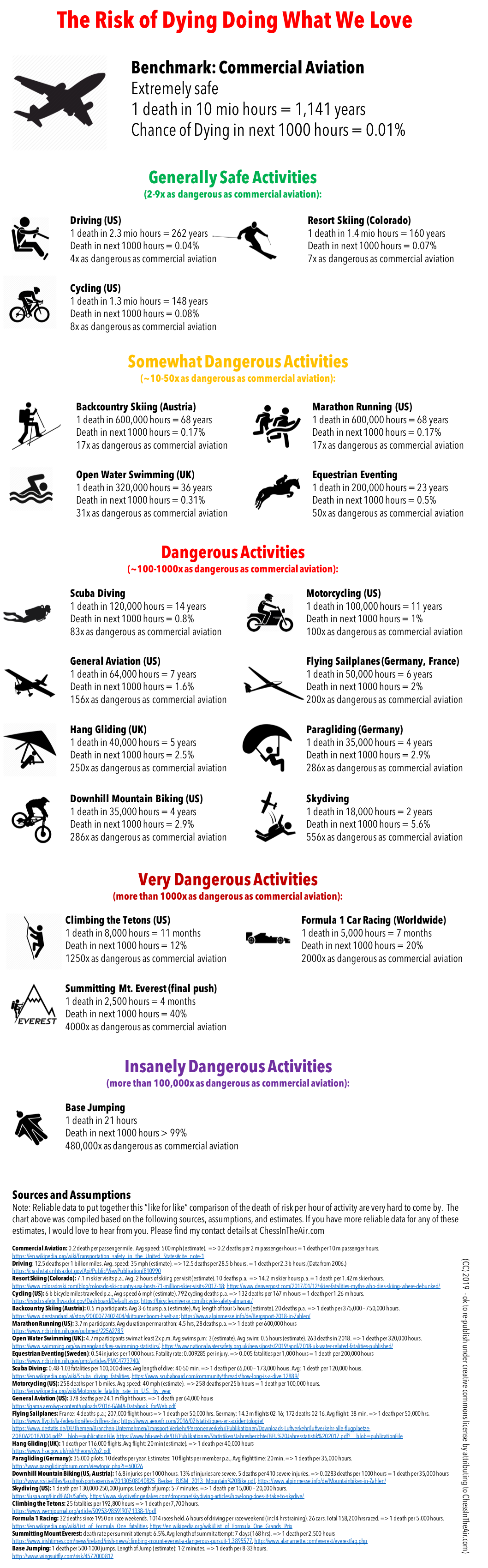
The graphic that we’ll get to below shows what I came up with. To facilitate the readability of the comparison, I benchmarked all activities against traveling on commercial airlines, which happens to be one of the safest things you can do when you leave your home: only once in 10 million passenger hours (i.e., once in 1,141 years) will a passenger die when traveling on a commercial airline. In other words, the chance of a person dying within their next 1,000 participation hours is only 0.01%.
Other activities that I participate in regularly such as driving, cycling, skiing (on and off piste), or marathon running aren’t nearly as safe as traveling on an airliner but they are still quite safe.
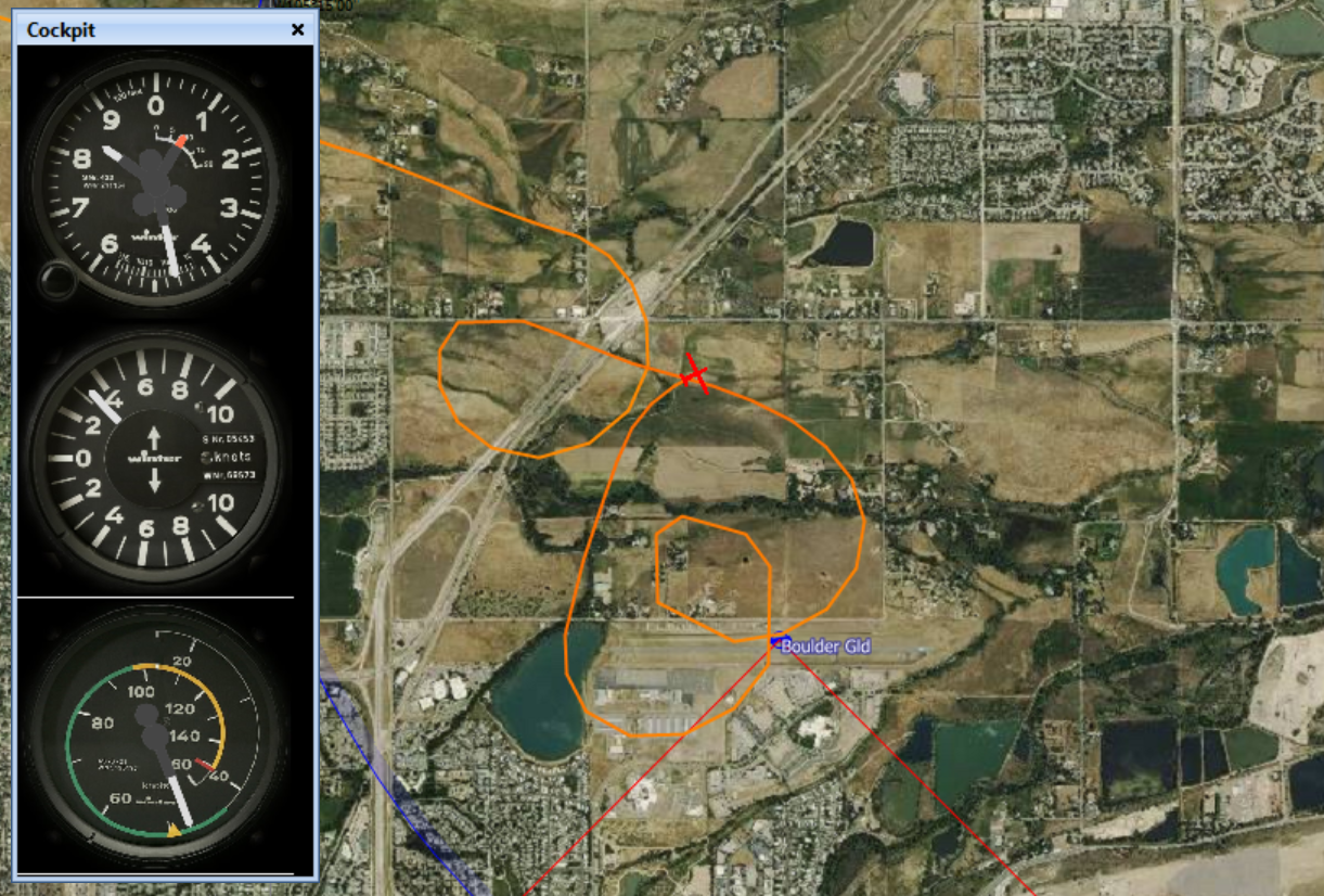
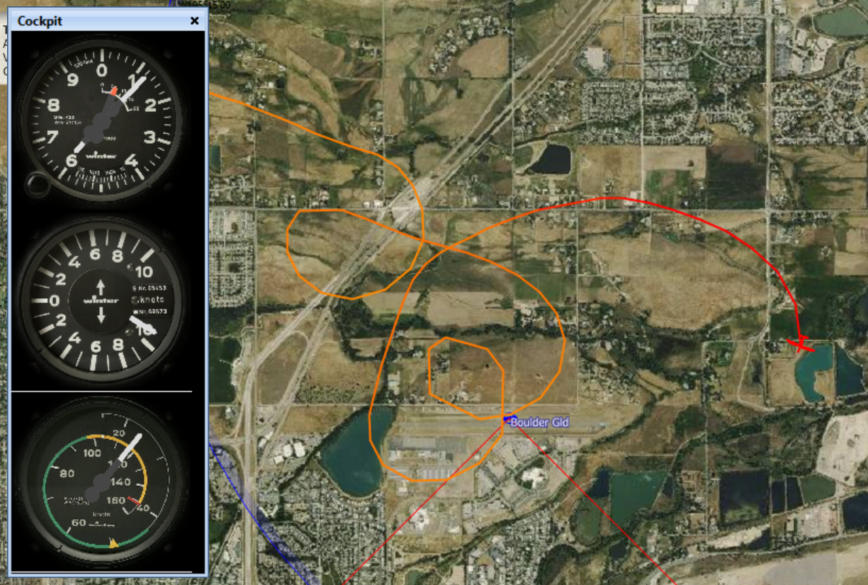
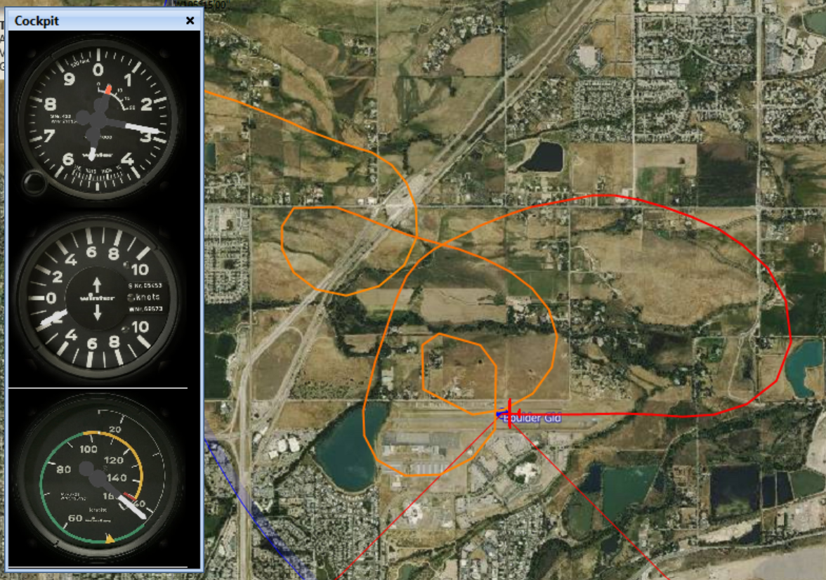
Unfortunately, my favorite sport, flying sailplanes, aka soaring, is one of the more dangerous activities. There are no reliable participation data available for the US but I found quite solid information for Germany and France where soaring is much more practiced than in the US. In both countries the sport has a fatality rate of 1 in 50,000 participation hours; i.e., the risk of dying within the next 1,000 hours of participation is 2%, about twice as high as the risk involved in riding motorcycles. It also means that an active pilot, who flies about 100 hours per season, has a 1 in 50 chance of dying in the sport within the next decade, and it makes soaring about 200 times more dangerous as traveling on a commercial jet. Other air sports tend to have similar risks: flying powered airplanes is just a little bit safer whereas hang-gliding and paragliding are somewhat more dangerous.
Some of the data surprised me. E.g., I found driving, skiing, and cycling to be safer that I expected, whereas climbing the Tetons and especially Mt Everest is actually much more dangerous than I anticipated. Not surprising to me was the insanely high risk involved in Base Jumping, which is shown to be 480,000 times more dangerous than commercial aviation, with an expected death per 21 hours of participation, and practically no chance at all to survive the next 1,000 hours of flying through the air. If you’re a Base Jumper you are likely to complain that my methodology of counting only the short duration of the jump (and, e.g., not the time you spend climbing up the mountain) puts your sport into an unfair light. To that I say feel free to count differently if you want to convince yourself that jumping is safer than it really is. As I pointed out above, you certainly won’t be alone in your desire to deceive yourself.
Unfortunately, all the information in the chart below only refers to the risk of death and does not account for the risk of injuries. The reason is simply the fact that data about injuries are extremely unreliable since the great majority of sport injuries are never reported and/or accounted as such. (The omission of injury information also means that activities that tend to have a relatively high injury to death ratio (e.g. skiing, equestrian eventing, marathon running, riding motorcycles, hang gliding, paragliding, downhill mountain biking) might look relatively safer than they really are, and activities that have a relatively low injury to death ratio (e.g. general aviation, soaring, skydiving) might appear relatively more dangerous than they really are.)
Without further ado, here is the chart:
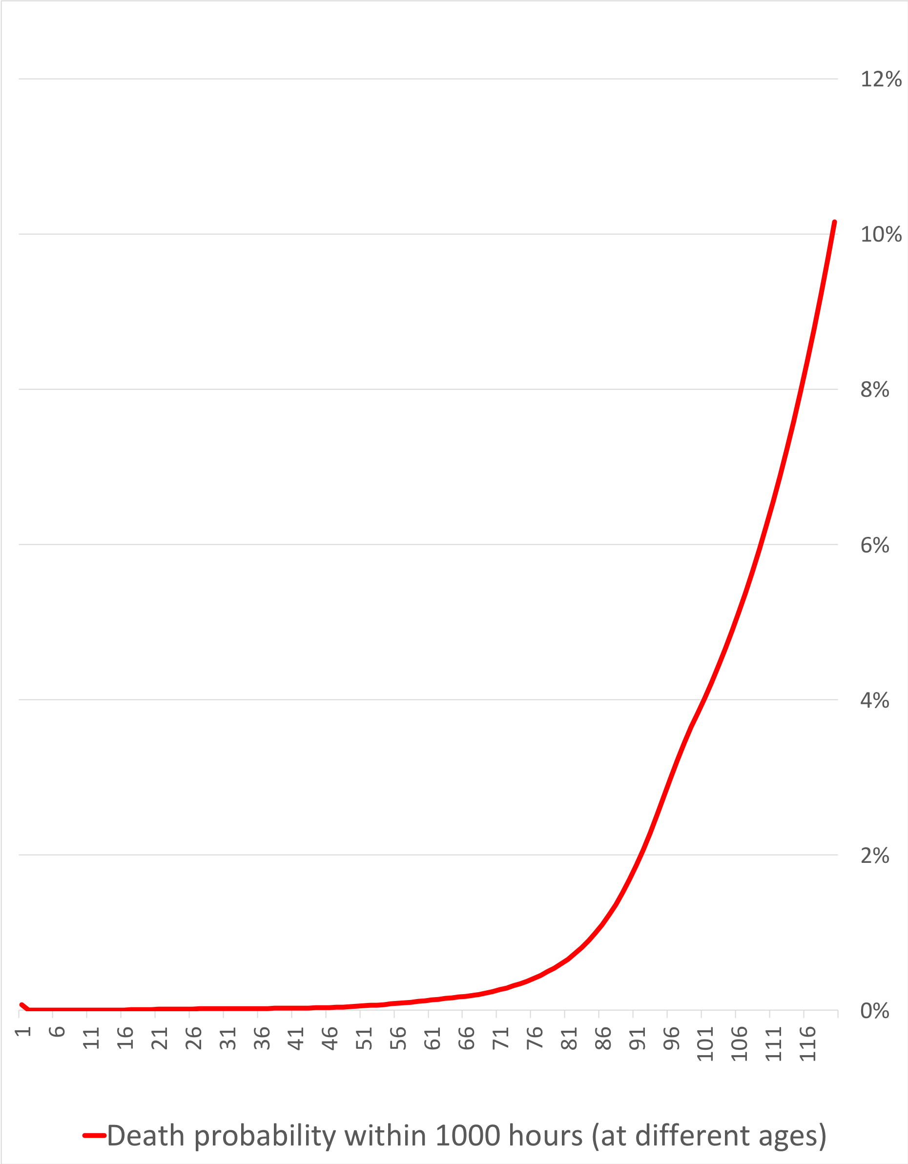
Another way to look at the same data is to compare them to the normal risk of dying (of any cause) at different life stages. Life insurance companies keep track of these risks as they seek to adjust their premiums based on the age of the insured. It should be intuitive that an 18 year old person has a much lower risk of dying within their next 1,000 life-hours than a 90 year old.
Below is a chart that shows how this normal risk of death increases as you get older. E.g, the odds that an average 18-year-old American male will die within their next 1,000 life-hours is about 0.01%. This happens to be exactly the same odds as traveling on a commercial airliner, once again illustrating how save commercial air travel has become. A 90-year-old male, by comparison, has a 1.9% chance of dying within their next 1,000 life hours. You can see how the slope of the curve remains fairly flat until the age of 50, and how it really steepens around 75. If someone manages to survive until the age of 119, their odds of dying within the next 1,000 life-hours will have risen to 10.2%.
(The source of this information is the US Social Security Administration. Note that they report the risk of dying within the next year, which I converted to the risk within the next 1,000 life hours, i.e. 41.7 days. Note also that the risk level tends to be slightly lower for females since their life expectancy is higher, but for our purposes the gender differences are negligible.)
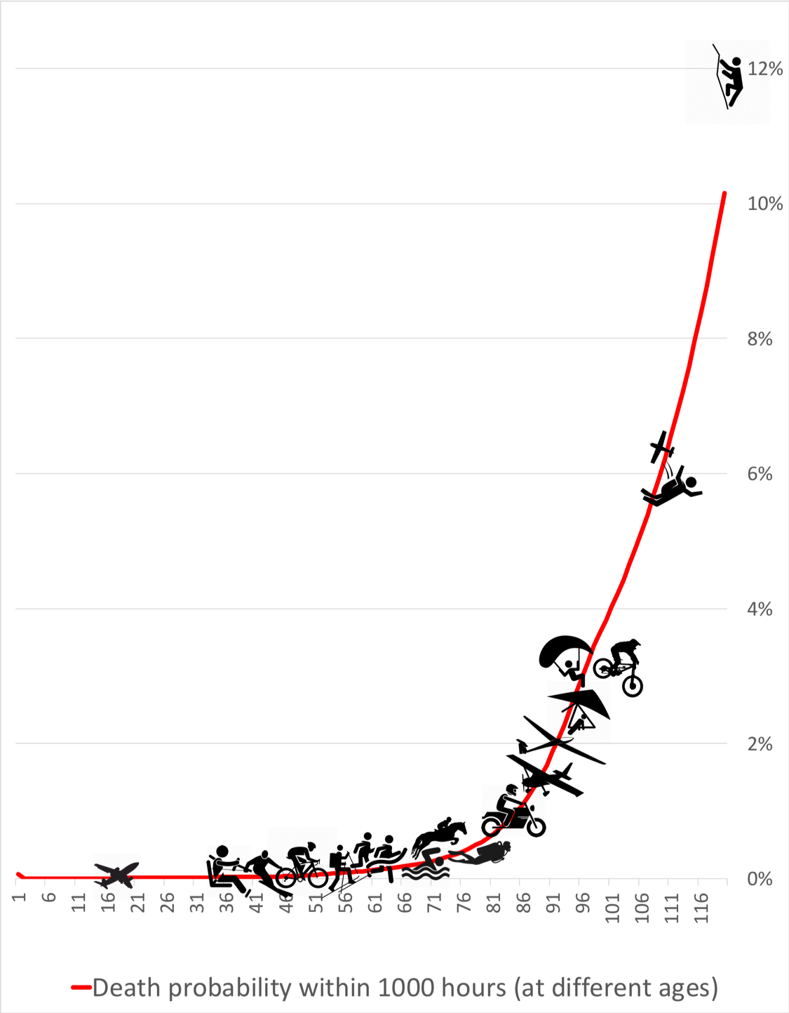
So how do the risks of the various activities compare relative to the normal day-to-day risk of dying at different ages?
To illustrate this, I placed the activity icons onto the same chart (see below). Once again, you see that commercial air travel is the safest of these activities. Driving, skiing, cycling, back-country skiing, and marathon running are all along the relatively flat part of the curve. The risk of dying per hour when swimming in open waters or while participating in equestrian eventing is about 0.3%, equivalent to the risk that an average 71 year-old person faces in their day-to-day life.
As you move right and up along the curve, the risk level increases much more noticeably. Scuba diving is about as dangerous as being 80 years old, and motorcycling corresponds to the normal risk of being 85. Several air sports come next: general aviation, flying sailplanes, hang gliding, and paragliding. Each of these is about as risky as the normal lives of people aged 88 to 95. Downhill mountain biking also falls into this category.
As you continue further up the slope you can see two outliers: skydiving is about as dangerous as the normal life of a 107 year-old and climbing the Tetons is about as dangerous as being 119 yeas of age.
Three activities from the initial graphic above are still missing: Formula 1 racing, Climbing Mt. Everest, and Base Jumping. The dangers of these three sports are so great they are literally off the chart because the Social Security Administration does not compute death risk statistics for anyone older than 119. (You probably don’t know anyone of that age either.) Since Formula 1 racing is about 2x as dangerous as Climbing the Tetons and Climbing Everest is another 2x as dangerous, you can roughly imagine how high up the risk curve you have to go. With Base Jumping even that becomes impossible: it is more than 100x more dangerous than climbing Mt. Everest!
Why put all this information together? I believe we should all be fully aware of the risks that we take, and that we should let our awareness of these risks be an incentive to take the appropriate preparations and precautions to reduce these risks as much as possible. Most of the fatal accidents in sports are at least in part the result of human error and could have been avoided. If we close our eyes to the risks (as we are naturally inclined to do in order to remove this pesky thing called cognitive dissonance), we are also unlikely to do what it takes to keep the risks contained.
Commercial aviation is a great example that risk mitigation really works. After the invention of powered flight in 1903, flying was certainly one of the most dangerous things humans could possibly do. Gradually and over time, this risk has been reduced to such an extent that commercial air travel is now one of the safest things we participate in.
The concrete risks and the strategies for risk mitigation are obviously quite specific to each of the different activities and discussing them is beyond the scope of this article. But risk mitigation strategies do exist for all activities and deploying them deliberately and consistently can be very effective (for some activities probably more so than for others). If you do something that is objectively dangerous (and now you know that it is), learning about these strategies and taking them seriously can truly help you stay alive.
Have fun and be safe!